


 Gift Cards
 Film Index
 FAQ
FAQ Kodak Ektar Film
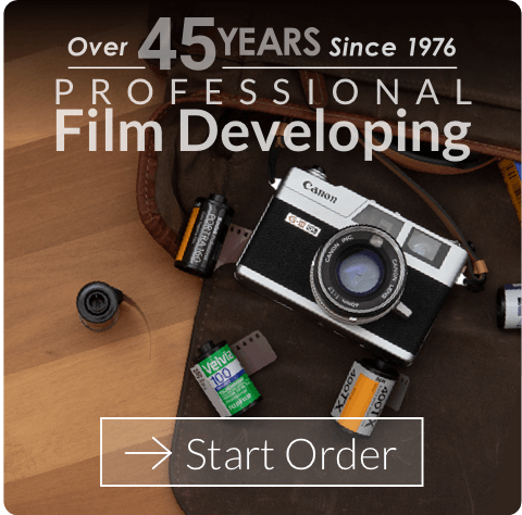
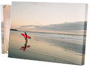
Great for landscapes
Beginner photographer here. I’ve been shooting 35mm for about a year. I can definitely tell you that in optimum daylight, Ektar is the way to go for bold, color-rich pictures. Today I went to shoot a roll of Ektar at a local lake park in Dallas, right after I’d finished a roll of Portra 160. I did hedge my bets sometimes by setting my aperture half a stop down from the recommended light reading, but even the ones with the recommended settings are pretty awesome. Especially in comparison to Portra 160, the Ektar pictures are vibrantly colorful and sharp. Happy shooting!
Warm Fine Grain
This was my first ISO 100 Color Negative film. I used it outdoors just as the first fall colors emerged and also in the studio on a tripod. The film did its job well.
The Landscape Photographer's film.
Ektar 100 is sharp, saturated, and loaded with color pop. Loves light like no other. Narrow latitude. But expose it carefully, give it some scenery under great light, postcards will fly out of the back of your camera if the composition is right. A great alternative to Fuji Velvia and easy C-41 processing and scans.
Bright, saturated colors, but...
Really bright, saturated colors, though almost borderline “clown colors.” The reds and oranges sometimes get over-emphasized. Still, all in all, a vivid, colorful film. My biggest complaint about it is that it has less latitude than I’d hoped for. If I expose for the highlights, the shadows tend to close up. That’s true of film in general,. but I think particularly so for Ektar.
My favorite Kodak film
Personally, I’m usually not a huge fan of the typical Kodak “look”, I tend to lean towards the cooler tones of Fuji. But, I bought some Ektar a while ago and finally convinced myself to shoot it. I’m so glad I did. Since I’m not typically a Kodak fan, I love the cooler look, deeper blacks, and heavier contrast of this film. It even performed will in my point and shoot, which I did not expect. My only gripe is that I wish there was a higher speed version of it. But, I’ll take what I can get.
One of my favorites!
Love this film stock, always unbeatable quality in direct sunlight. The first 100 ASA film I ever shot, always providing perfect shots with unbeatable quality. This stock loves the sun, and the beach.
More latitude than expected
Living in Mediterranean Barcelona, where we have lots of hard sun days, it seems obvious why I love Ektar so much. But do not get me wrong, this film has much more benefits than expected. To me, it looks like a wonderful slide film with great warm colours but with the benefit that it has much more latitude than expected. I shot it with a meterless camera, most of times I overexpose more than 2 stops, and the film looks always amazing.
Punchy reds!
Great film stock for when you are feeling bold and looking for saturated colors. Very low grain
Best for outdoor use
Vivid colour saturation, great contrast, and sharp edges. But unfortunately too slow for indoor use. Too bad Kodak does not produce an “Ektar 400”. Portra simply does not produce Ektar 100’s explosion of colour.
Know when to use it
I love this film when I go out and shoot landscapes. I’ve also found when I’m walking around downtown in the morning to have this film loaded.
Spring/ Daylight Is the best time to shoot.
This is my first time ever shooting this film. If you like minimal grain this is the film for you. I used it to shoot some flowers and this film works amazingly with reds and yellows. Some of my photos were a tad bit overly saturated especially with the reds; however, I really enjoyed its ability to bring out those colors.
Colourful Chef, Nikon F3/T, 50mm F1.4
A great film with strong punchy colours. This was shot at ISO 200 but i wouldn’t go further with it.
Perfect for Spring Colors
The film has great saturation. I thought spring was the best time of year to test this out. Pinks reds and yellows really pop with this film. Some shots with long exposures can have a slightly pink hue. This can be taken advantage of for sunsets. Overall this is a great daylight film.
A very strong color neg film
Love the colors that came out of this film, very saturated (tastes depends from person to person, but I like saturated films). Colors can get quite warm and orange-y at times, especially when the sun is around. Very clean looking images that come out of this, and I want to shoot it again…;that is, if my wallet agrees with my wants.
Great colours
I was looking got something in place of slide film, specifically Velvia, and this really does a great job. Easy to shoot with and get developed. I save it for sunny days and fine weather so using it always makes me happy 🙂
Colors that punch
My favorite color film is Portra 160 but this is better if you want punchier colors out of the box. Grain is very little. As others say it almost looks digital. I still like the overall look of Portra 160 better but if you’re going to be shooting something that’s colorful and sunny this is your go to. Skin is easy to fix in post as well if you want to do portraits.
Daylight? No better film out there IMHO
Although 100 might seem slow, I’ve shot Ektar at box, speed, pushed +1 (i.e. 200) and +2 stops (i.e. 400), making it more versatile than one might initially think and the results at box speed are what you’d expect from a professional highly regarded film: – Fine grain, great colors (although maybe not the best for portraits of white people, but easily fixable in post).
Strong colors
This stock is almost too saturated for my taste, because it makes it look almost digital. However, the color”pop” is especially good in colorful environments (in my case: southeast asia)
Old Faithful
My go-to color daylight film; fantastic value, very fine grain, rich color. I’ve used this in many varying situations and am always pleased with the results. Many don’t use as a portrait film, but I use it all the time, especially outdoors.
My favorite color film
This film bridges the gap between film and digital. It retains some of the “film” look but has detail and color that approach digital. The average person (non-photographer) might actually have a hard time telling the difference. I LOVE the way the colors pop. A blue sky is BLUE! Going back through all of my 35mm film shots over the years, all my best shots (IQ) were with Ektar 100. Definitely my favorite c-41 color film.
Finest Grain - Heavy Saturation - Nothing Better in Sunlight - good cost
If you don’t mind saturated skin tones, everything in the shot is going to pop with color. Throw a polarizer on and shoot some heavy vegetation in full sunlight, or mountain landscapes. The film is relatively affordable for a pro level 35mm, and is oftentimes readily available (from film providers). The proof is in the pudding, and my favorite shots from the last 5 years are with Ektar. Better latitude than slide film.
Near digital results with a touch of film character
Punchy colors & contrast with low latitude when compared to Portra. Super sharp & very fine grain.
Film with a digital taste
The tiny grain in addition with great contrast and vivid saturation somehow creates a feeling, that it’s a digital not a film picture. The detalization is outstanding. It is a great choice for all types of photography. It’s also nice for portraits, but in addition with Photoshop / Lightroom. The main and the only one disadvantage – the colours are so vivid, that very often it could give bright red tints.
Film with a digital taste
The tiny grain in addition with great contrast and vivid saturation somehow creates a feeling, that it’s a digital not a film picture. The detalization is outstanding. It is a great choice for all types of photography. It’s also nice for portraits, but in addition with Photoshop / Lightroom. The main and the only one disadvantage – the colours are so vivid, that very often they could have bright red tints.
Punchy Colour
If you want high saturation with negative film then this is worth a try. It has very fine grain and good colour impact. It’s skin tones are. It great and some colours are a bit inaccurate but it’s still very nice. With Ektachrome back on the market I doubt I’ll shoot much Ektar going forward
Colours pop
This is my favourite colour negative film as I like the saturation. It’s not great with skin tones and some colours can look a little inaccurate but if you want some colour punch with C41 then give this a try. With Ektachrome back on the market I doubt I’ll shoot Ektar going forward.
Excellent film with some unique quirks that are easy to use
This film is heavily saturated, and really emphasizes reds and greens. It’s not very good for skin tones, but works great for photos of flowers and still shots.
One trick for getting some really good looking photos is to under expose it by a full stop when taking photos of red flowers, like roses. The flower petals will still come out great, and the leaves will be exposed as a deep blue-green color.